
Saturday, April 30, 2011
Saturday Book Review: Emily Giffin
Today's book review is about author Emily Giffin. I've read 3 of her 5 books and I'm on the latest right now, Heart of the Matter. The first one, Something Borrowed is my favorite still and now a feature film. All five books have the characters intertwined somehow. They are about relationships (friends, family and significant others).

Friday, April 29, 2011
Born in the Sky: Poems by Pediatric Patients
These photos document a collaboration between Writers in the Schools, Children's Hospital, and the letterpress artists of the School of Visual Concepts to beautifully present poems written by patients in the palliative care program. Poems were written with the guidance of WITS writer-in-residence Sierra Nelson.


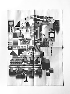
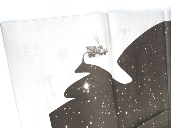
Jesse LeDoux
Local (Seattle) designer/illustrator Jesse LeDoux. Also teaching at School of Visual Concepts. Some pieces for Bumbershoot, 2011.
About Jesse:
Born in Portland, Oregon, Jesse LeDoux worked for many years as an art director for Seattle-based Sub Pop Records where he created iconic album and poster artwork for such artists as the Shins ('Best album packaging' Grammy nominee for Chutes Too Narrow), Iron and Wine and Death Cab for Cutie before leaving in 2004 to focus on his client-based and personal work at LeDouxville. Parallel to working on commercial illustration and collaborative projects for such clients as Nike, Kidrobot, Giro, Penguin UK, Rome Snowboards and Target, he has exhibited internationally. His work was included in the Cooper Hewitt Design Triennial (2007) and an installation at the University of Maryland (2008). A large-scale mural of his work can currently be seen in downtown Denver, Colorado. He currently lives and works in Seattle, WA.


Thursday, April 28, 2011
Adrian Forrow Promotional piece
I like this promotional piece by Adrian Forrow. It's nice to see newspaper being used in an interesting way. As long as we recycle after we are done with it! :)


Wednesday, April 27, 2011
Things Organized Neatly


Tuesday, April 26, 2011
Ad only visible when it rains
Great idea from Fresh Green Ads. The ad for Sea Life aquarium in Scheveningen, Holland only appears when it rains. This would be great to do in Seattle-people would see it all the time. Although it's beautiful out today. Via AdFreak.
Monday, April 25, 2011


Friday, April 22, 2011
Happy Easter!
I'll be on vacation for a couple days. If I don't get a chance to post, everyone have a Happy Easter! Now this is an Easter bunny! Read more about him here.


Letterpress Friday: Two Paperdolls
Two Paperdolls is an amazing letterpress/design studio in Pennsylvania. Their blog is amazing as well. Some of their work below. I really want one of these clocks.


Happy Earth Day!
No plastic water bottles for me today. Actually, I haven't used a plastic bottle since my post back in February. Here is a cool interactive flash animation put out by GOOD about America's energy use. Click here.


Thursday, April 21, 2011
Manifestos of great designers


Wednesday, April 20, 2011
4/20
Check out all the crazy stuff that happened on 4/20. Can't wait for Amsterdam in September! :)
Click here.

Click here.

Tuesday, April 19, 2011
Posters of Fortune
Via designworklife. What a great idea! Here are some of my faves...
Posters of Fortune is a current initiative of The Type Directors Club and Cardon Copy. Twenty internationally renowned designers were each sent a fortune cookie, and then charged with the task of creating a typographic poster inspired by, and featuring, their own distinct fortune. The resulting posters will be
on display at TDC, and available for bidding, through May 12th, with all proceeds going to the Type Directors Club Scholarship Fund.
 |
| Abby Low |
 |
| David Pearson |
 |
| JongeMeesters |
 |
| ilovedust |
Monday, April 18, 2011
F8 Conference Badges
I love when innovative thinking is put into mundane things you see all the time. These are interesting, well thought out and very nicely designed by the in-house team at Facebook. Via fonts in use.
The conference badge is a challenging design conundrum. John D. Berry duly likens them to highway signs in this Font magazine article. How do we create a template for names which vary widely in length, while making each one legible enough to reduce the chances of an awkward chest gaze?
The in-house design team at Facebook, including Ben Barry and Everett Katigbak, engineered one of the more innovative solutions in their tags for last year’s f8, the Facebook developer conference.
The typeface is the Narrow width of Facebook’s identity face, Vista Sans. Xavier Dupré’s informal design sets a friendly tone for the event, and its open aperture and extra large lowercase let names be read at a quick glance from a distance before resorting to the ol’ now who am I talking to here? stare at close range. Be sure to check out the rest of Ben’s work. He does nice things with type.


The conference badge is a challenging design conundrum. John D. Berry duly likens them to highway signs in this Font magazine article. How do we create a template for names which vary widely in length, while making each one legible enough to reduce the chances of an awkward chest gaze?
The in-house design team at Facebook, including Ben Barry and Everett Katigbak, engineered one of the more innovative solutions in their tags for last year’s f8, the Facebook developer conference.
“When we were first talking about the booklets and badges we had a bunch of Field Notes journals laying around that our friends at Gowalla had sent over. We immediately thought it would be a good booklet size and thought too it was a good size for a badge. Never wanting to take the easy way out we decided to go for it and make the badge and booklet one piece.” — Ben Barry
The typeface is the Narrow width of Facebook’s identity face, Vista Sans. Xavier Dupré’s informal design sets a friendly tone for the event, and its open aperture and extra large lowercase let names be read at a quick glance from a distance before resorting to the ol’ now who am I talking to here? stare at close range. Be sure to check out the rest of Ben’s work. He does nice things with type.


Sunday, April 17, 2011
Photographer Corey Arnold
A while back I stumbled upon Portland based photographer, Corey Arnold. I recently saw a write-up on his work in GOOD.


Saturday, April 16, 2011
Saturday Book Review: GOOD Magazine
OK, so not a book, but a fantastic magazine. The price of a subscription is up to you and the money goes to a charity of your choosing. The magazine is very well designed and packed full of information that's all good. Subscribe here.

Friday, April 15, 2011
Thursday, April 14, 2011


Subscribe to:
Posts (Atom)